SciSkew Collaborative
Brand strategy, logo design and 3D store concepts in Shanghai for a New York retail brand.
From May to August 2009 I was an assistant designer at SciSkew Collaborative, an architecture and design studio in Shanghai. The brief was a brand strategy and spatial concepts for a New York retail company, working under the name Wild Thing. I worked on site in Shanghai and developed the research, the brand identity, the logo designs and the 3D store mock-ups.
The branding study
In June 2009 I put together the analyses that opened the project. The branding study looked at how other retailers win attention and loyalty: Urban Outfitters and Anthropologie mixing clothes and furniture in displays that keep people in the store for over an hour, Target’s designer collaborations, Muji’s minimal packaging, Primark’s value labels, Uniqlo’s window displays, the science-fiction shop of Billionaire Boys Club, and Chanel’s nostalgic glamour. Each store got its strengths, its weaknesses and its target market.
A logo comparison traced how Nike, Walmart, Apple, Starbucks, Target, KFC and Burger King had changed their marks over decades, and sorted the likely competitors’ logos by category, from apparel and electronics to kitchen, sports and stationery. A mascot analysis followed Mickey Mouse, the Burger King, Target’s bull terrier, Colonel Sanders, the Beijing Olympic Fuwa and Haibao, the mascot of the 2010 Shanghai World Expo, to ask what makes a character carry a brand.
Logo trials
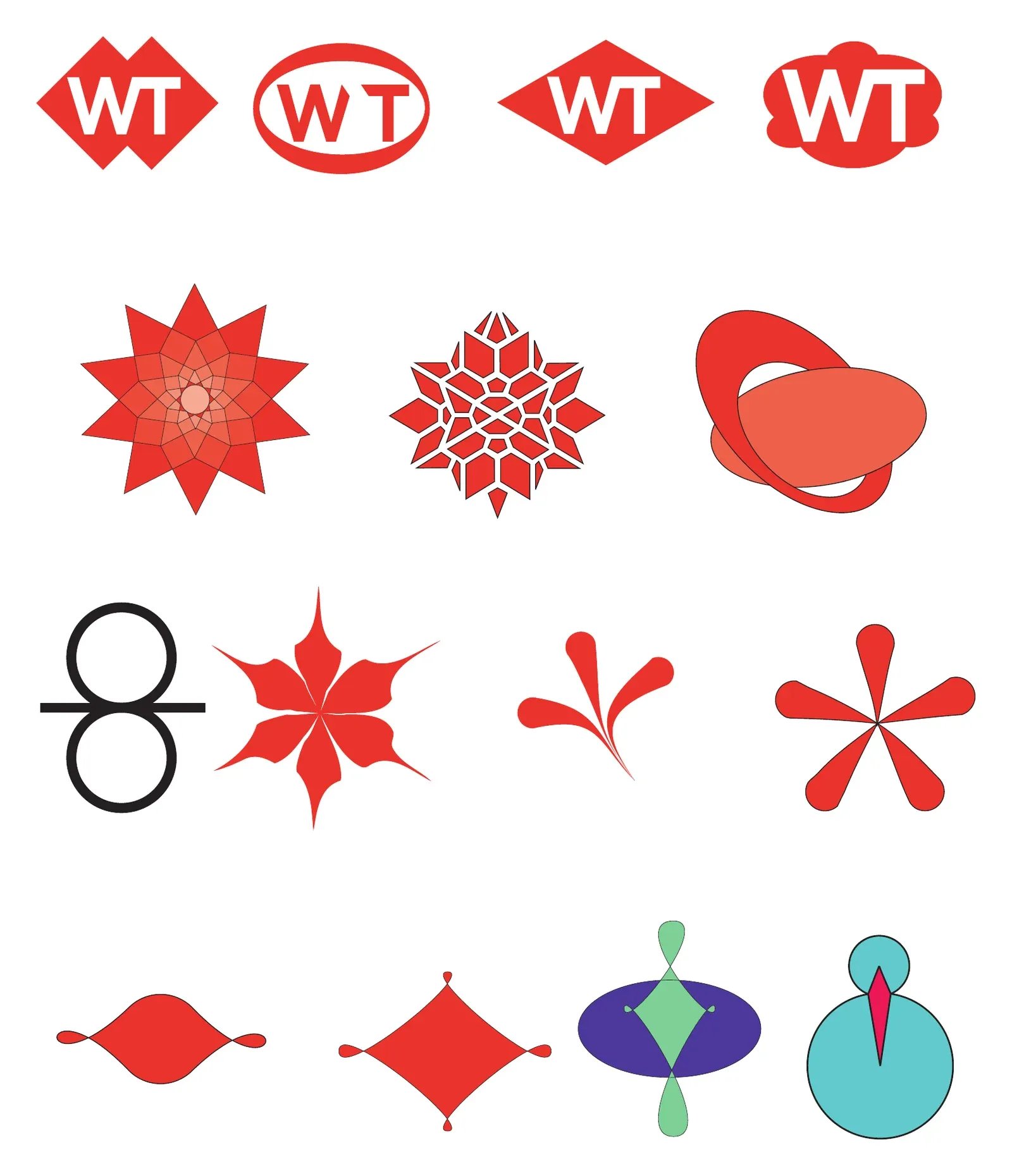
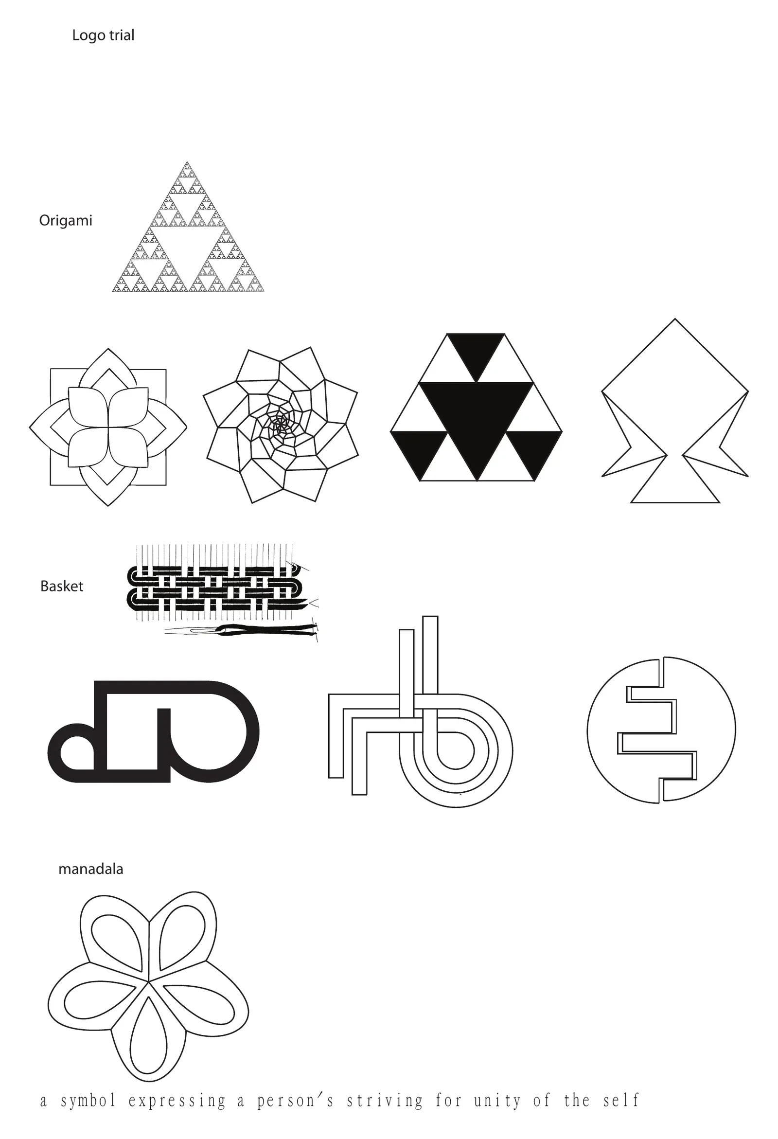
The logo work moved from a WT monogram in red badges to a family of red flower and star forms, and on to three directions named after the store concepts: Origami, Basket and Mandala, the last described in my notes as a symbol of a person’s striving for unity of the self. A separate sheet tested the marks against packaging, from boxes and bags to folded paper.
Store concepts
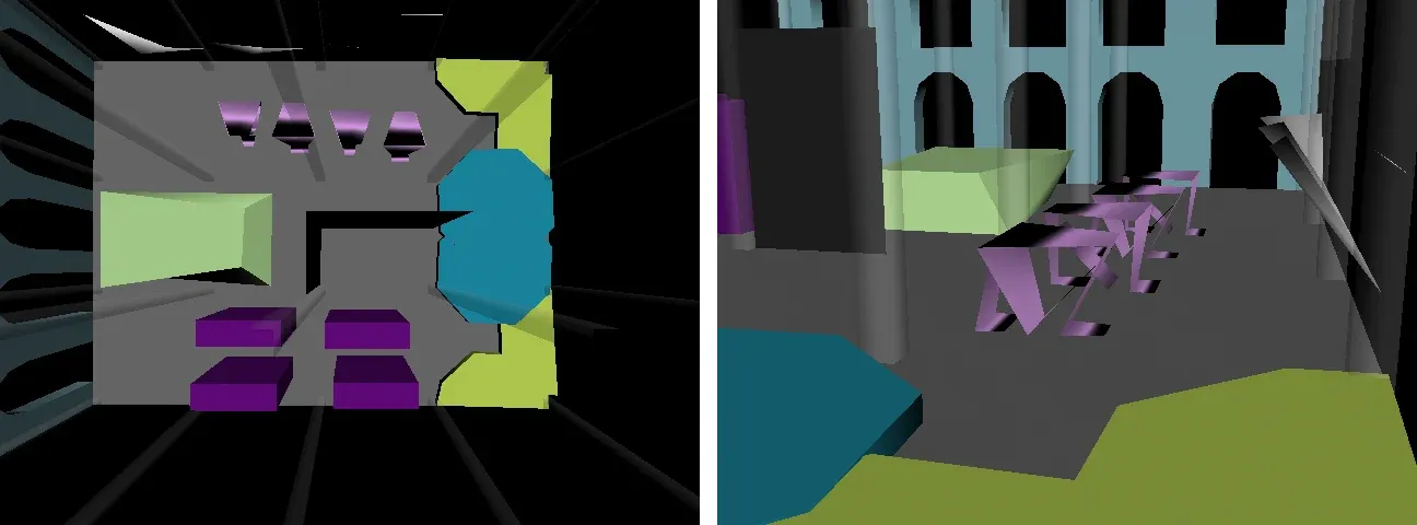
In July I modelled the store in 3D. The first massing models, on 2 July, worked out the plan and the display islands for the Origami concept inside an arched stone building.
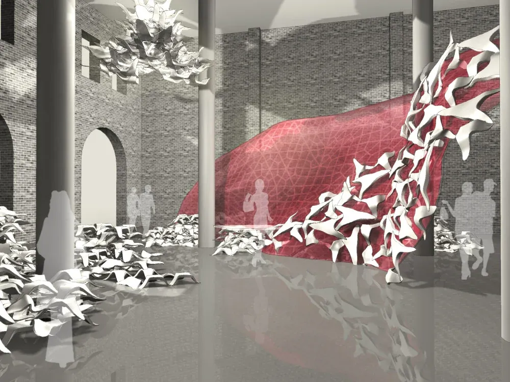
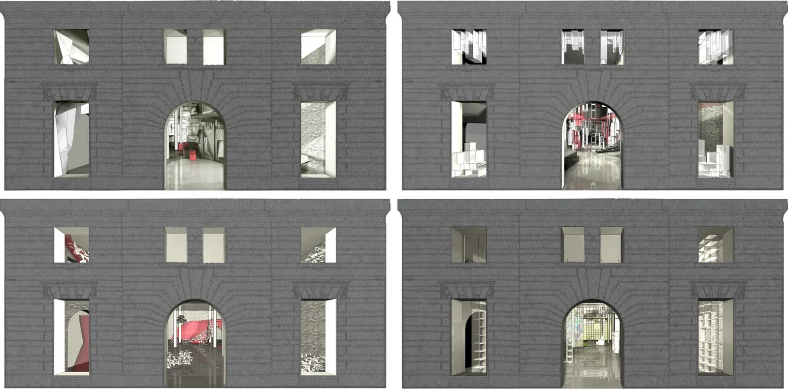
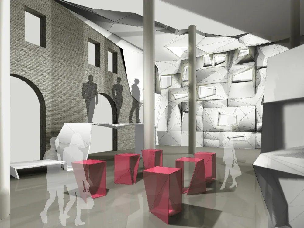
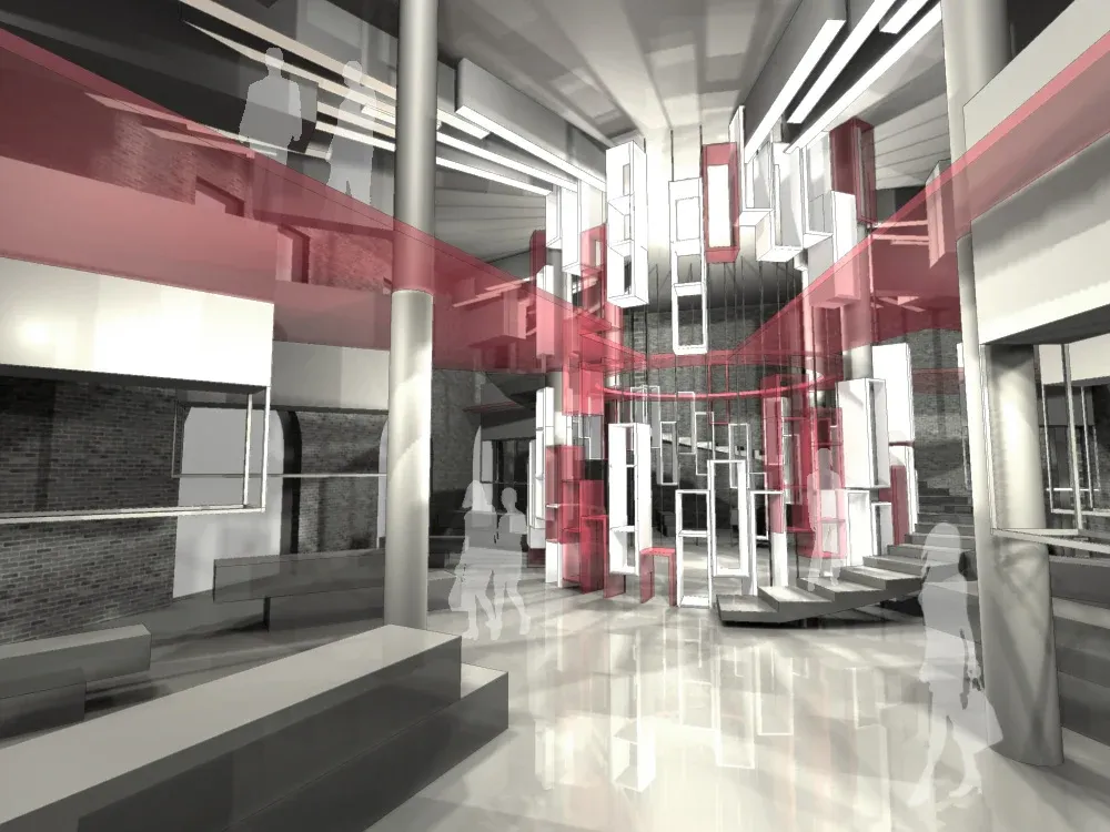
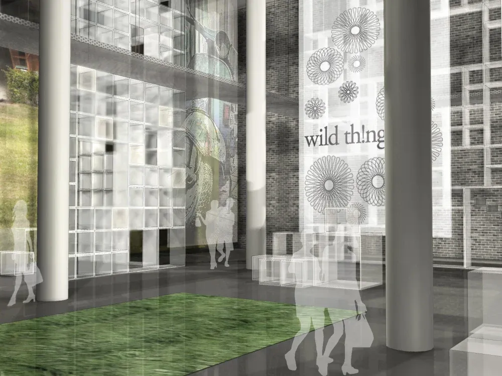
By 9 July there were four concepts, each set in the same arched stone facade so they could be compared directly: Origami, with folded white walls and red faceted plinths; Mandala, with red layered screens rising through a central atrium; Tribe, with a red canopy of folded white birds sweeping through the space; and Domestic, with shelving, a lawn of green carpet and the Wild Thing name on frosted glass.
The Tribe interior, with its red canopy, is at the top of this page.
What carried forward
SciSkew was my first time taking a brand from research to a space people could walk into.